Interpretive Signage
Interpretive signage speaks to your visitors when you can’t. Here’s how we think of best practices with interpretive signage. There’s a lot here, schedule a no-cost zoom call if some outside perspective brainstorming would be helpful.
Start with why - Imagine standing in one location as your visitors pass you by - what information would they want to or need to know? That’s how you can think of the applications for signage in parks. Interpretive signage should support the interpretive direction that comes from your site or your system’s core interpretive themes. These are common signage solutions and why they might be right for you:
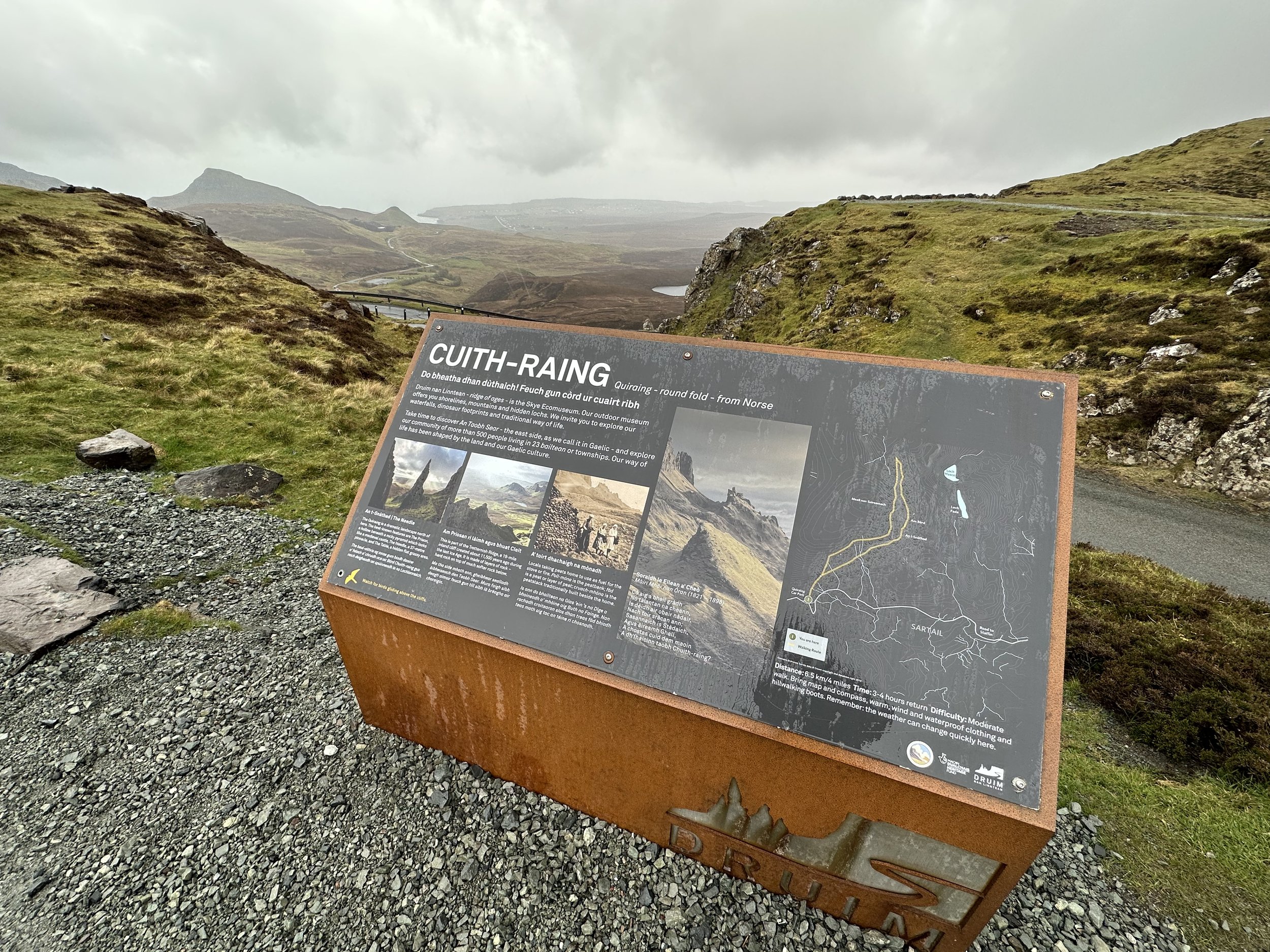
Visitor Orientation Panel - these “you are here” style signs pair a map with the most critical information visitors need to orient them to their experiences.
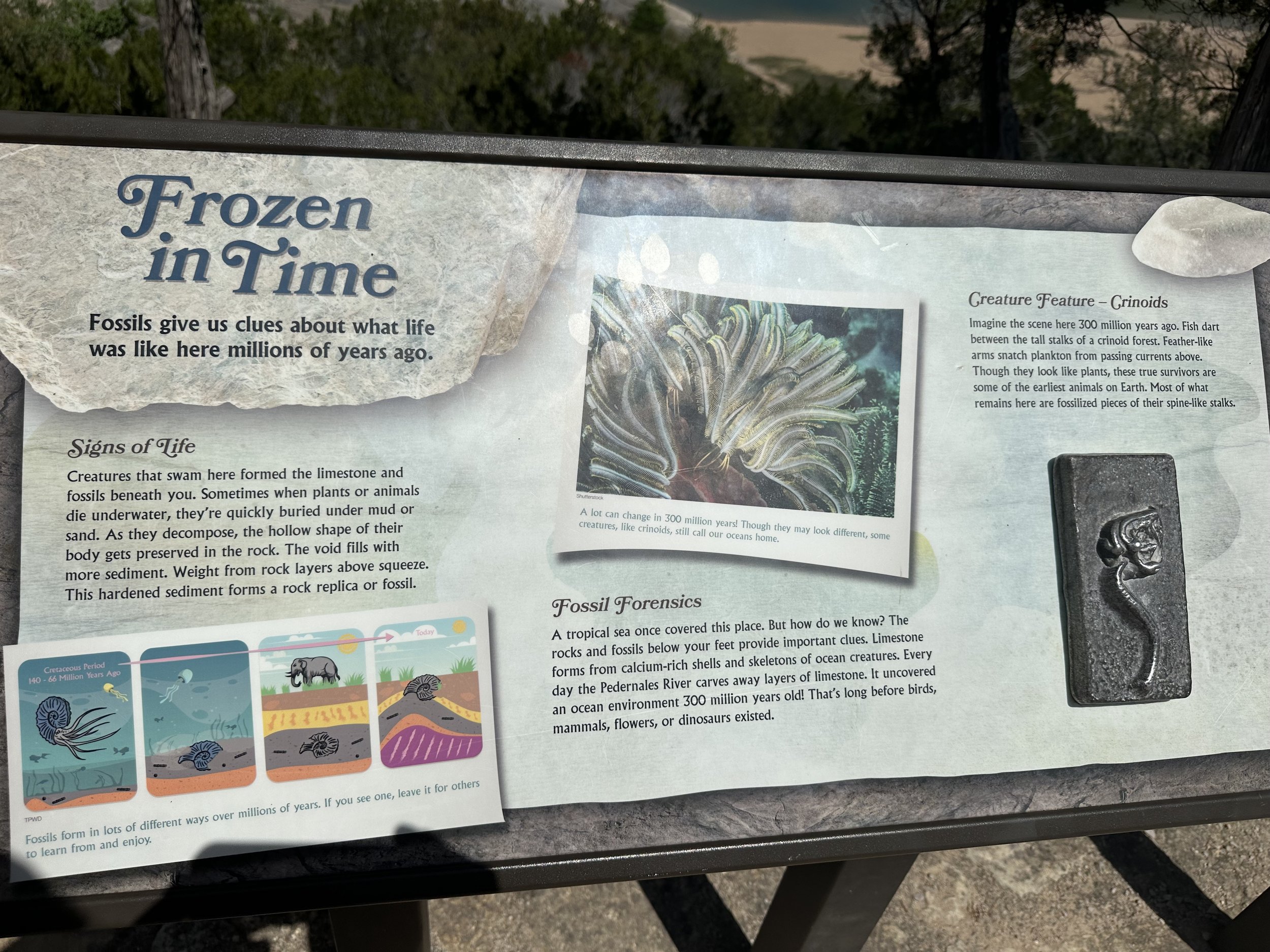
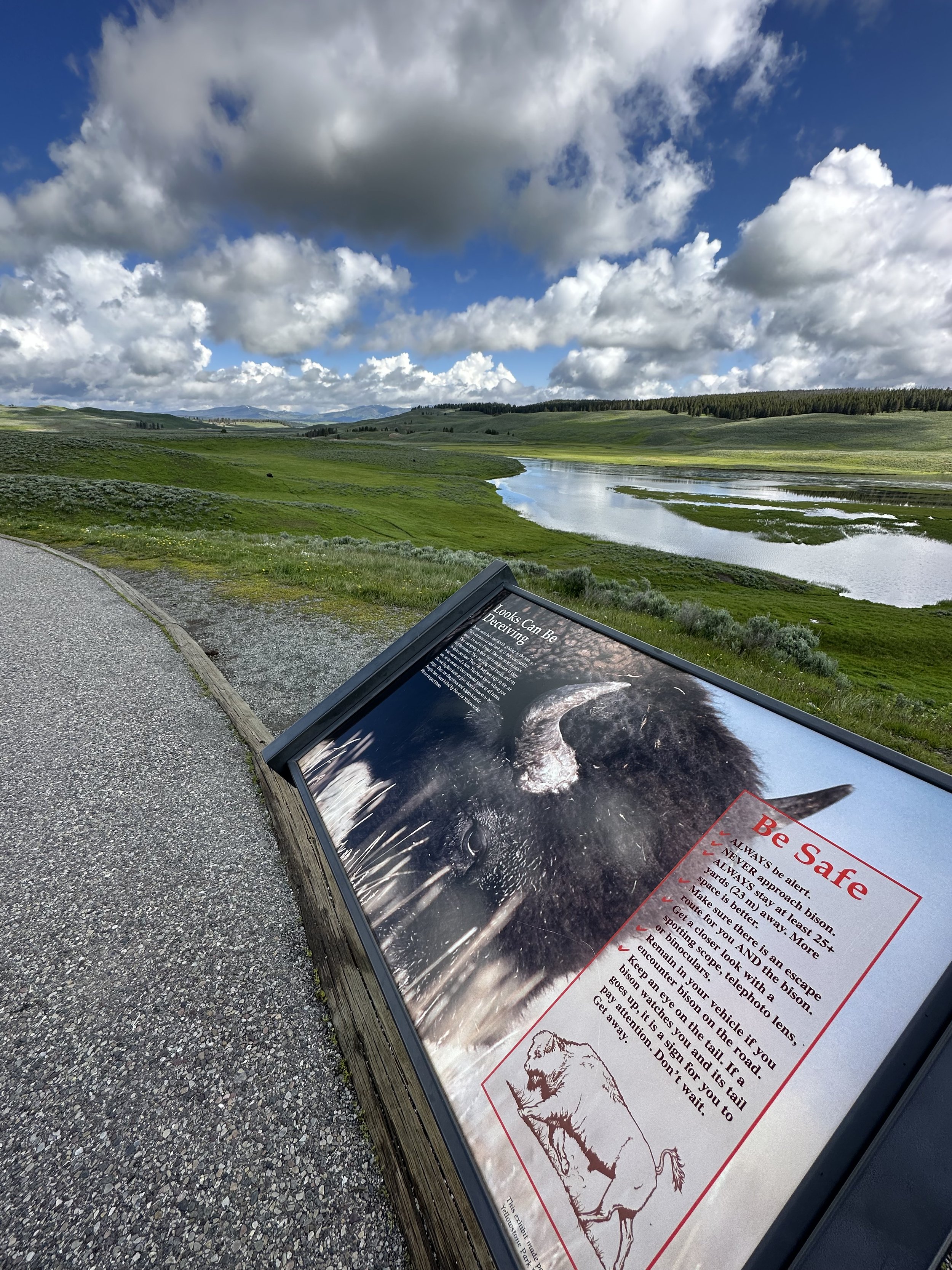
Interpretive Wayside - often designed as 18” x 24” signs or 24” x 36” - these signs tell the deeper truths of your site’s resources. More about planning and designing interpretive waysides below.
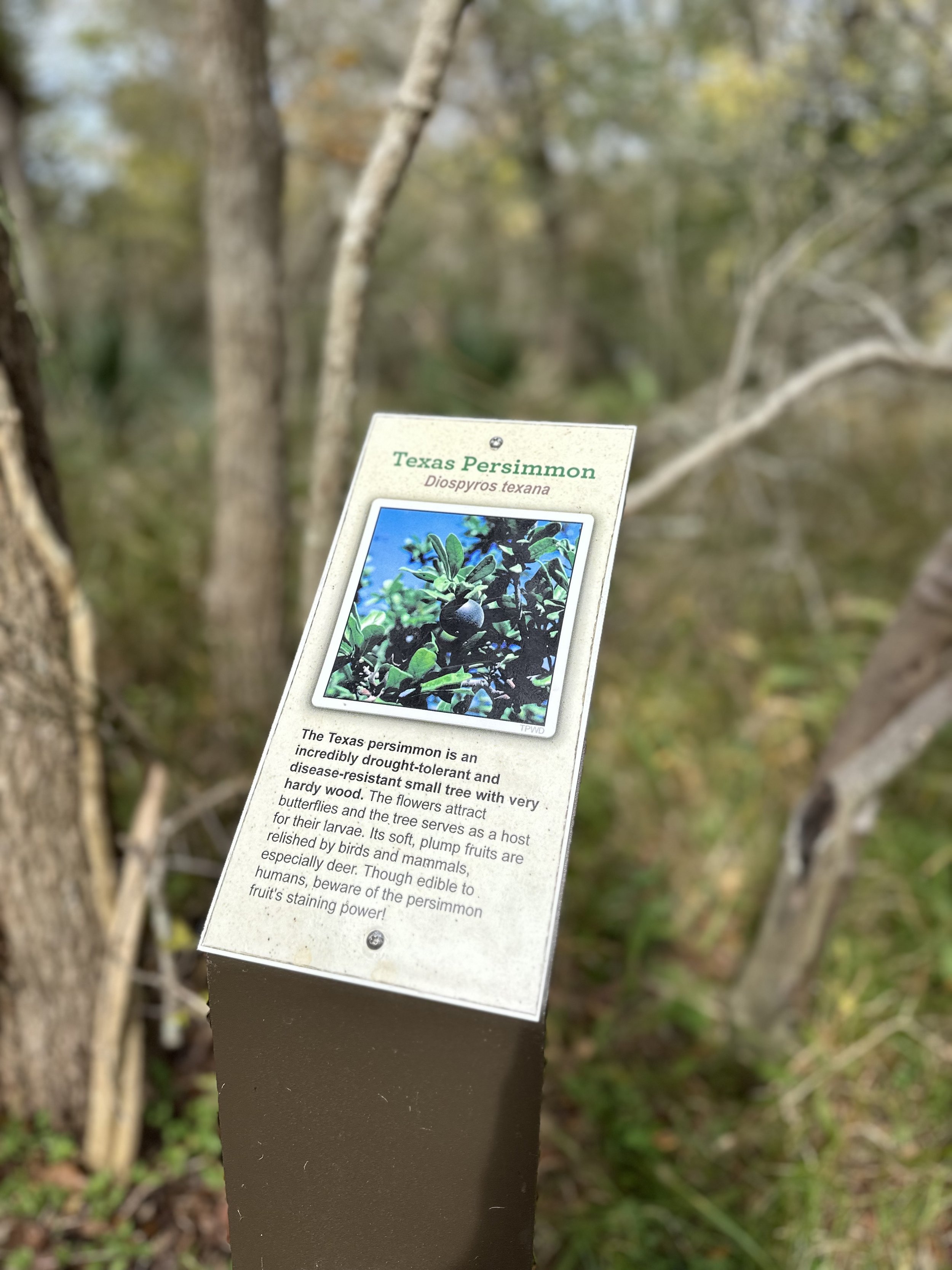
“Big Thought, Smalls Signs” and Plant Markers - sometimes less is more. Plant ID Markers might simply identify common species along your trail or in your garden. Pair that with thoughtfully-crafted short, powerful interpretive text to share more about why visitors should care. Our Big Thought, Small Signs are a simple, turnkey approach to interpreting your site’s resources.
Planning and Design Interpretive Signs - Anyone can create a sign, but designing an interpretive sign that your visitors will enjoy reading takes some thought. Here are strategies we recommend for planning and designing your interpretive signs.
Be Thematic - act like an interpreter to connect the tangible characteristics of your resources with the universal, intangible concepts your visitors understand.
Have A Hierarchy of Information - We teach the 3, 30, 3 rule - visitors will look at your sign for 3 seconds, 30 seconds, or 3 minutes. Having a hierarchy to your information can reach all of these readers. A good title reaches everyone. Subtitles and introductory text can reach visitors who scan your sign for 30 seconds. The rest of your text will be enjoyed by the less frequent visitors who will read the whole sign.
Design - chooses designs that reflect the professionalism of your organization and enhance the visitor’s understanding. Shutterstock and other image curation websites can be helpful, just make sure you the images are large enough that you can have 300 pixels per square inch.
Enhanced Engagement - Static interpretation is more inclusive and impactful with tactile elements. Consider outlets for QR codes and other digital portals to interpretive content woven into the visitor experience.
Fabrication and Installation are different for every site and budget. Schedule a no-cost zoom call and we can share some thoughts with you.


